

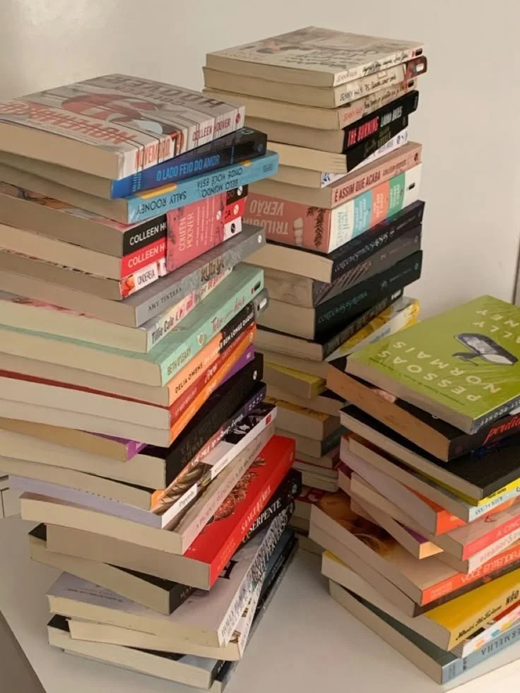
In today’s fast-paced world, many people struggle to find time for themselves and their hobbies, especially reading. Readdle makes building a reading habit easy and enjoyable, with gentle reminders, progress tracking, and a vibrant community to share reads with friends. Designed to be fun and pressure-free, it helps users turn reading into a daily ritual that fits seamlessly into their routine.


Main Objectives

Build a Consistent Reading Habit
Make Reading Fun and Engaging with challenges
Have a community
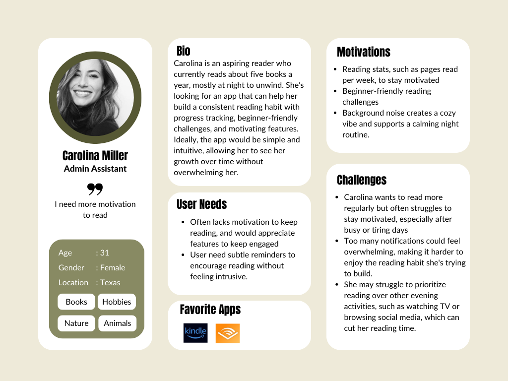
The User

Defining the
PROBLEM.

How might we create an engaging way to encourage busy adults to read consistently at a specific time of day?
How might we create an intuitive tracking system that helps new users build and maintain a regular reading habit?
How might we enrich the reading experience for those who read frequently during the day to maximize entertainment?
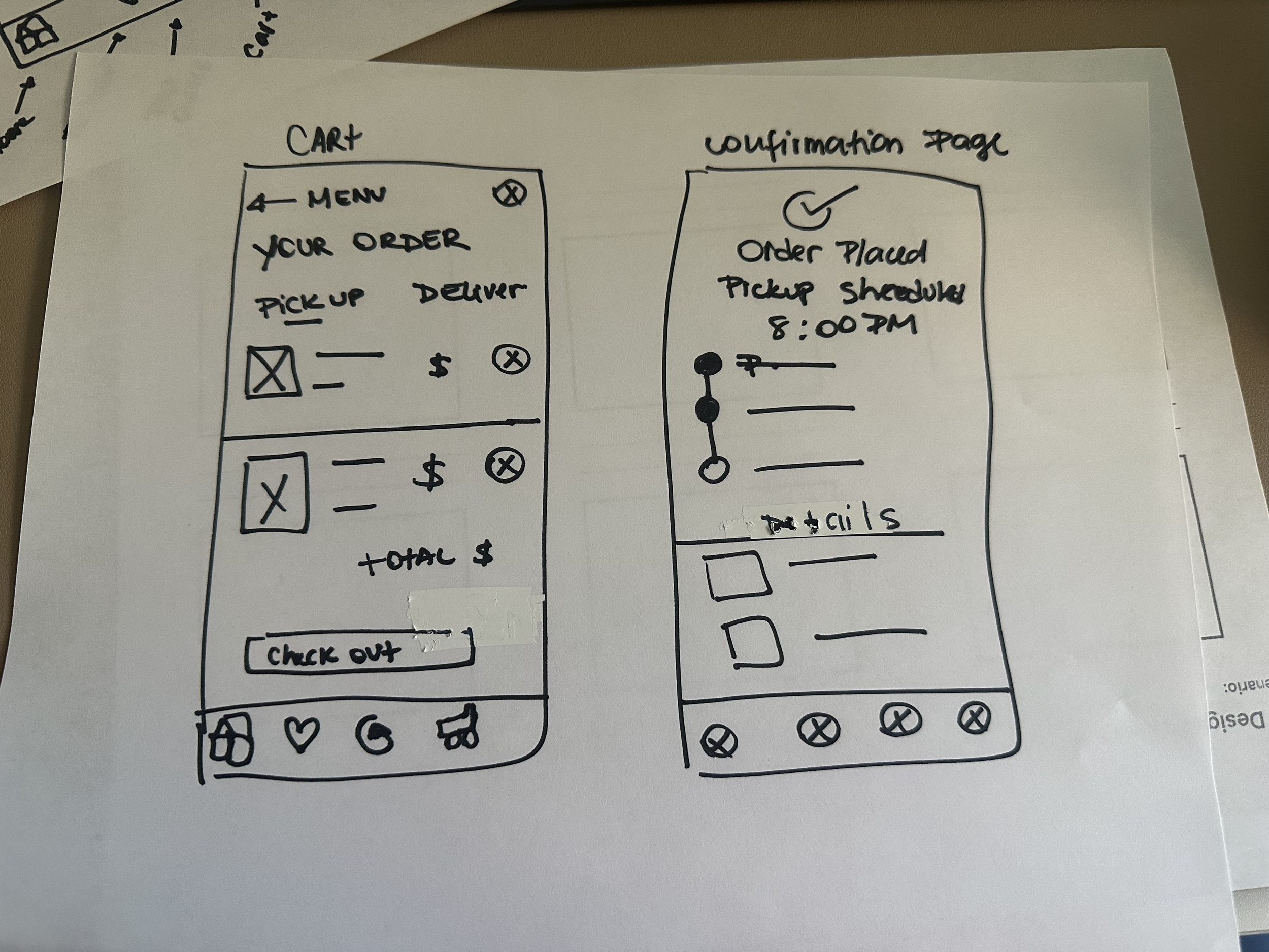
Early wireframes and task flows were designed to minimize friction, seamlessly guiding users from symptom tracking to personalized recommendations, transforming complex data into clear, actionable steps.
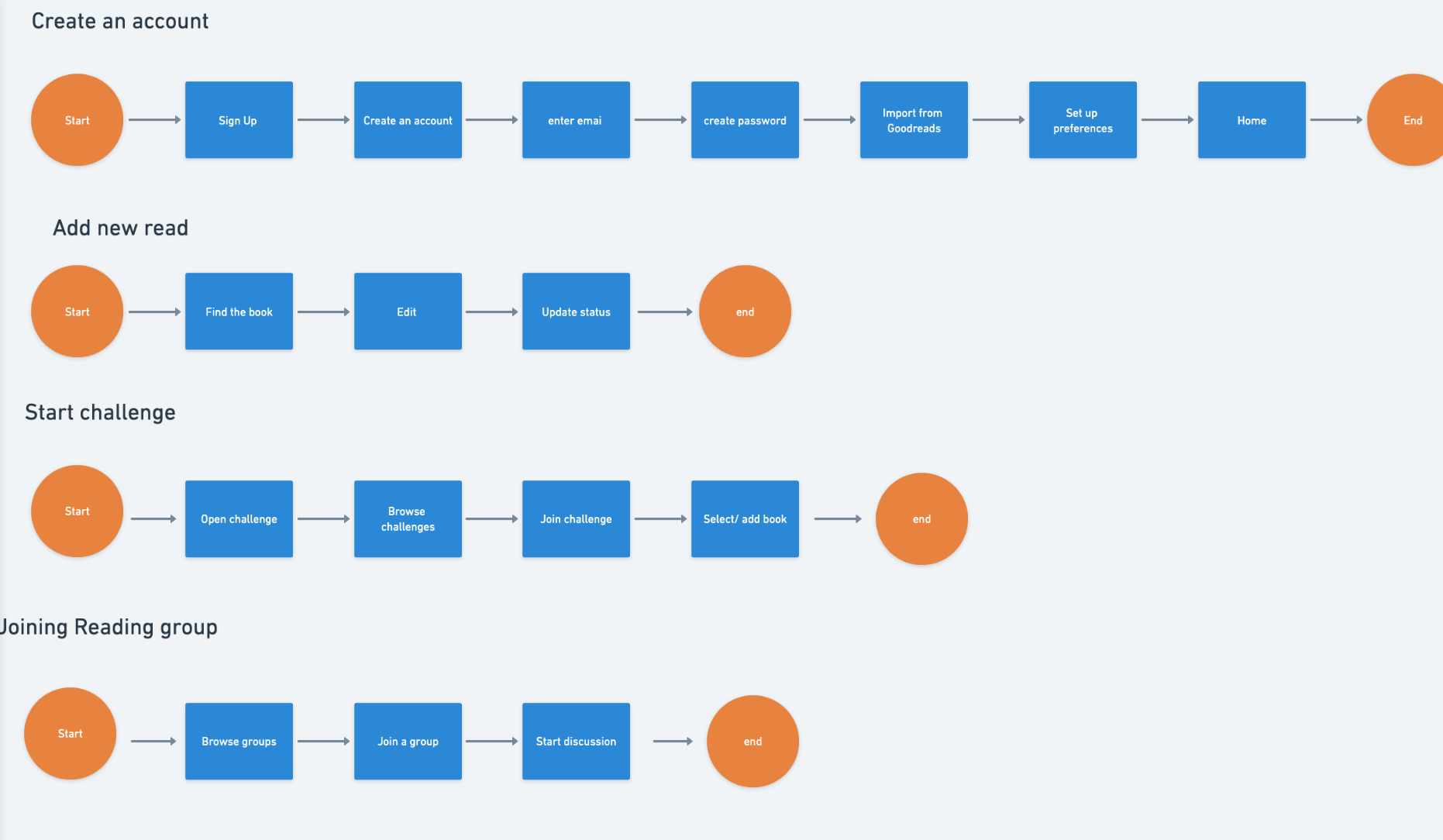
The Design
Task Flow

Low Fidelity Prototype
The Identity
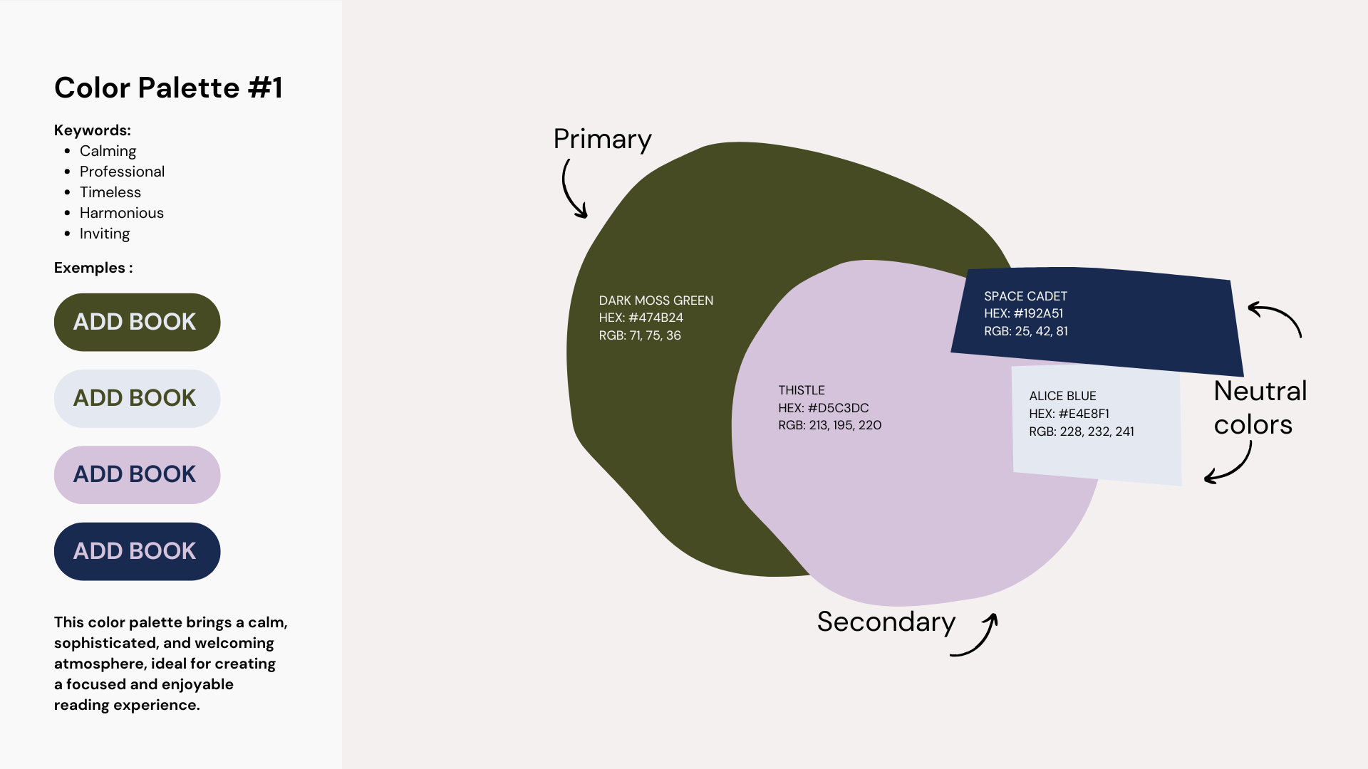
Color Identity
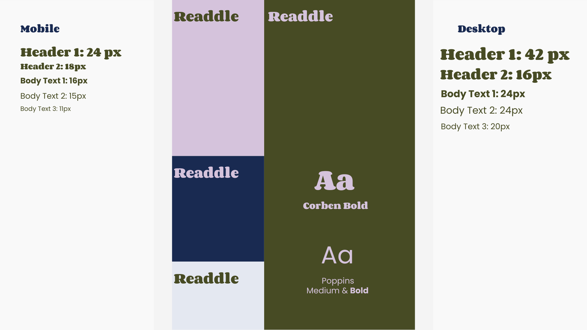
Typography
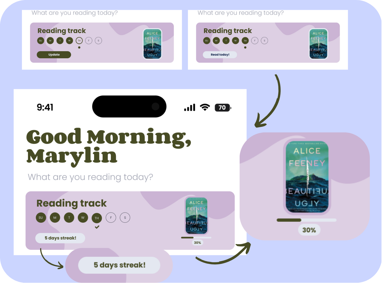
Low Fidelity Prototype
-
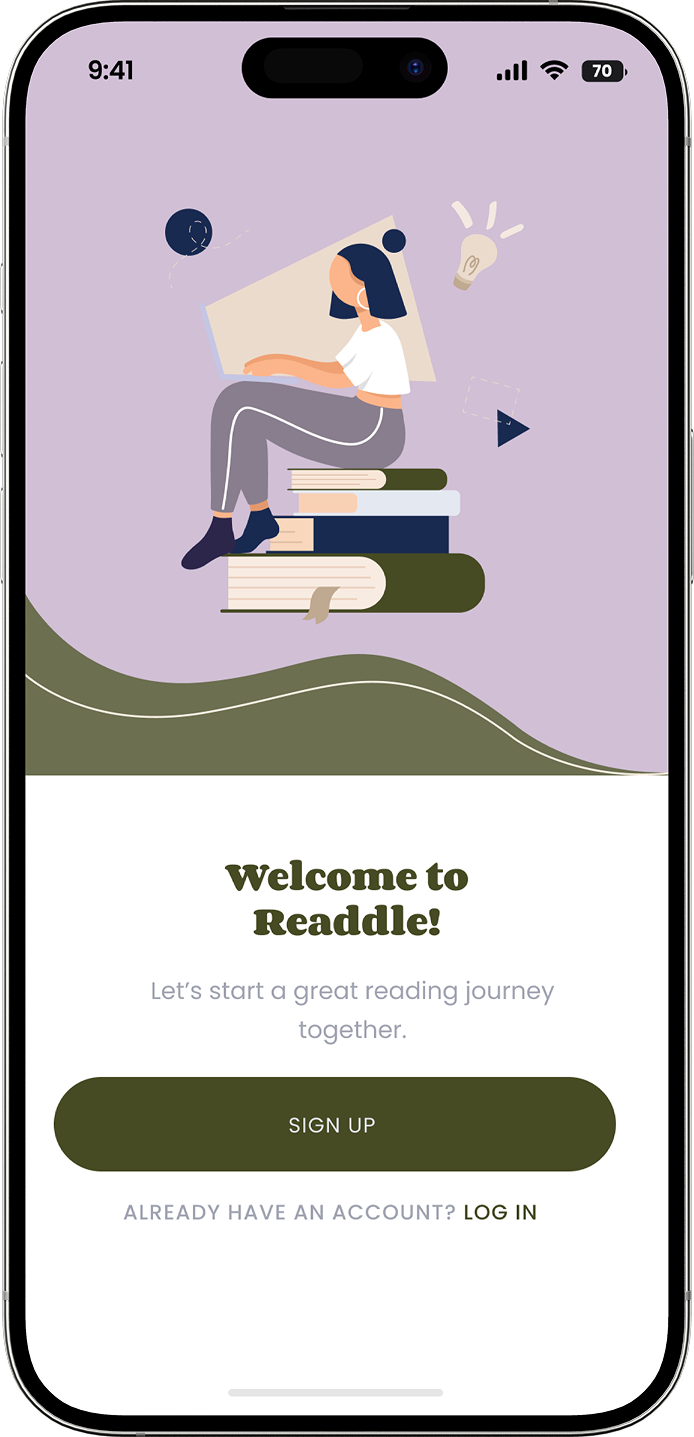
![Homepage]()
Homepage
-
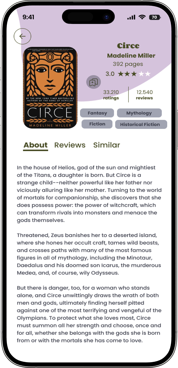
![Book page]()
Book page
-
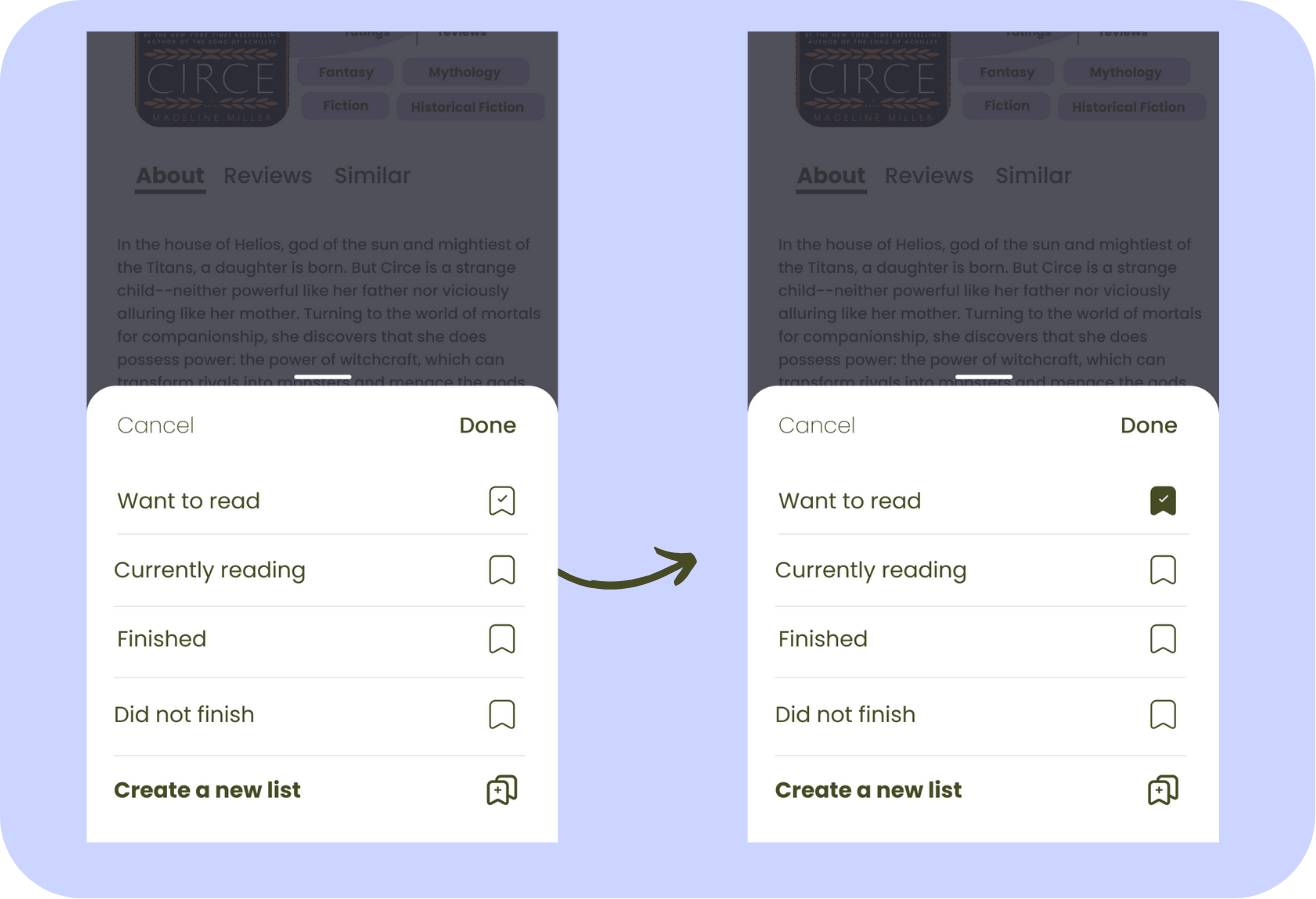
![Save read]()
Save read
-
![Search page]()
Search page
-
![Profile Page]()
Profile Page


High Fidelity Prototype
-
![Homepage]()
Homepage
-
![Book page]()
Book page
-
![Save read]()
Save read
-
![Search page]()
Search page
-
![Profile Page]()
Profile Page
-
![Challenge Page]()
Challenge Page
-
![]()
Challenge


The Test
Usability testing confirmed the concept, with users appreciating the clean UI and personalized features. Their feedback guided improvements on challenges, navigation, and consistency, resulting in a more intuitive and seamless experience.
What worked
Tracking Was Well-Received – The tracking feature was widely accepted and appreciated.
Customization Was Valued – Users liked the ability to personalize and categorize their bookshelf.
Challenges Sparked Interest – The challenge section generated high engagement among users.
Reminders Were Easy to Set – Users found the reminder feature simple and intuitive.
What didn’t
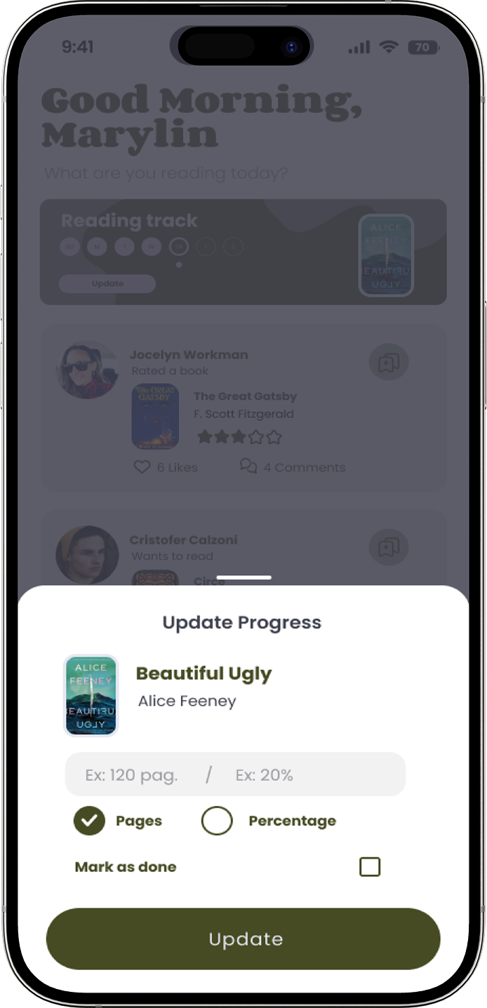
Add a Visual Progress Bar – Implement a progress bar to enhance tracking after updates.
Improve Customization Visibility – Make customization options more noticeable and accessible.
Clarify Challenge Opt-Out – Provide clear instructions on how users can leave a challenge.
Enhance Challenge Interaction – Make challenge participation more engaging and interactive.
Ensure Icon Consistency – Standardize icon names for a cohesive user experience.
The Revision

The updated design enhances user experience by providing clear confirmation when a challenge has been initiated. Additionally, a dedicated page has been introduced to streamline book selection for the challenge, ensuring a smoother decision-making process. Users also have a more intuitive and accessible option to opt out of the challenge if needed.


The results highlighted the need for a visual progress bar and a confirmation message indicating that their update was completed.
Additionally, a slight color adjustment for the buttons was made to enhance visibility and improve usability.