
This rebranding project marks a fresh new chapter for this craft club—celebrating creativity, community, and handmade joy with a more cohesive and modern visual identity. The update includes a refreshed logo, a warm and approachable color palette, and typography that reflects the playful yet thoughtful spirit of the group. Mockups of real-world applications, such as stickers, packaging, and event materials, demonstrate how the new brand system can be applied consistently while bringing charm and personality to every touchpoint.

Original Logo
The rebranding
Formerly known by a more niche and casual identity, the club’s original logo and look reflected its humble, DIY beginnings—but as the group began to grow, so did its vision. With goals to collaborate with partners, attract sponsorships, and expand beyond crafting nights into broader creative events, the club saw the need for a fresh start. The rebrand to Craft Club signals that shift, introducing a more versatile and polished visual identity with an updated logo, modern typography, and a vibrant, cohesive color palette. This new look offers a flexible foundation for future programming, while mockups bring the brand to life across potential event materials, merchandise, and sponsorship-ready assets.
Design Objectives
Establish a Professional and Approachable Identity
Create a visual system that feels polished enough for partnerships and sponsorships while remaining warm and community-driven.
Increase Flexibility for Future Events
Design a brand that can easily adapt across different event types and formats beyond crafting, such as markets, workshops, and creative meetups.
Strengthen Brand Recognition and Cohesion
Unify the club’s presence across platforms and materials through consistent use of logo, color, and typography to boost visibility and credibility.
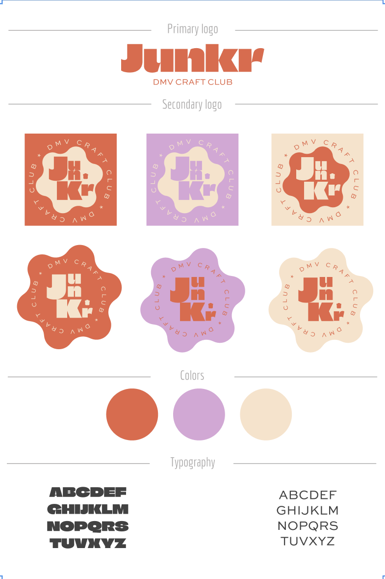
Brand Guidelines
Brand Guidelines
The new visual identity embraces vibrant colors to reflect the creativity and energy of the community, while introducing a unique, playful shape to give the brand a distinctive and lighthearted feel. The color palette was designed to be flexible—each shade can be mixed and matched to create dynamic, eye-catching combinations across different materials. To balance the playful elements, the typography features a simple yet bold font, ensuring clarity and consistency while still making a strong visual statement.
Logo Application


